WPA Beer Identity


Other Concepts Presented


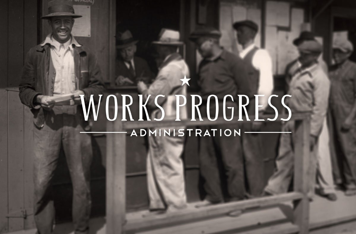
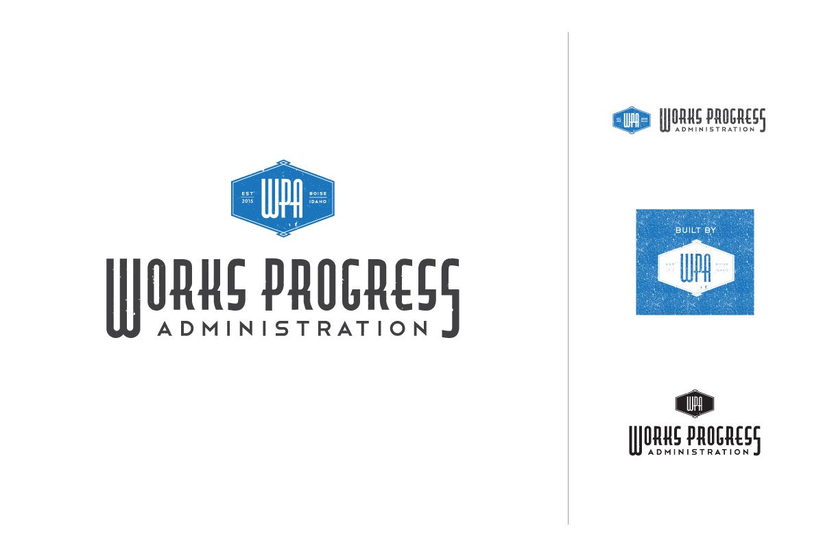
Works Progress Administration is a brewery. The logo is inspired by the government program that gave the brewery its name. I designed a custom typeface to resemble the imperfect steel letterforms common on original WPA plaques. The single off-kilter star alludes to the government program, and gives an air of optimism. Look closely at the “W,” and you’ll see an abstract eagle, facing right—another nod to the symbols of the original Works Progress Administration.
AGENCY: Oliver Russell
CD: David Cook
MY ROLE: Art Director